
5 Ways to Use Contemporary Neutrals in a Solid Oak Kitchen
Neutral shades can occasionally be unfairly judged when looking at interiors, as they are sometimes depicted as boring, or safe, options. Farrow & Ball’s collection of contemporary neutrals provide a fresh, clean choice and challenge the notion that neutral is boring. There are plenty of ways in which these colours can be used in a modern setting – we have complied a number of suggestions to help you keep your neutral design interesting and up to date.
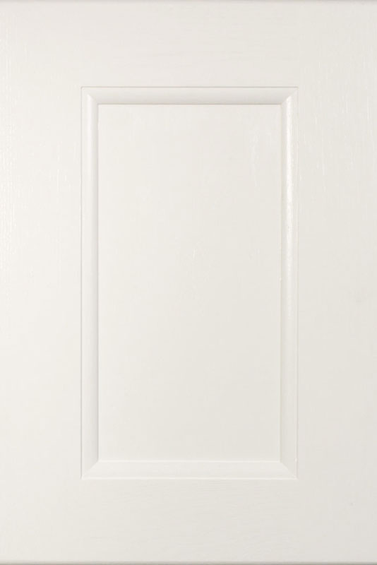
Texture
Adding texture to a contemporary neutral colour scheme is a fantastic way to add depth to the design. This is easy to do in a solid oak kitchen, as our painted doors will still allow the texture of the oak grain to be visible. Whether you want a fresh, light shade – like All White – or prefer something warmer – such as Dove Tale – the natural beauty of the oak will shine through, adding interest to the room.
Credit : farrow-ball
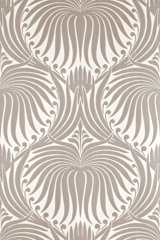
Pattern
Wallpaper is another fantastic option when looking to add interest to a neutral design. Farrow & Ball’s Lotus wallpaper in Skimming Stone and Charleston Gray features an intricate design that will add depth to any kitchen. The similarity of the colours used ensures the look will not overwhelm a room using a contemporary neutral colour scheme – fantastic for large spaces and small kitchens alike.

Credit : farrow-ball
Accents
Contemporary neutrals provide a fantastic foundation which will allow other colours to really stand out. Pairing accents of Pelt with a paler shade, like Elephant’s Breath or Skimming stone, will allow the statement colour to stand out, without it drowning the lighter colours. These neutral shades all have gentle lilac undertones, which ensures they work incredibly well together.
Metallics
As mentioned earlier in this blog, varying textures is a fantastic way to add depth to a contemporary neutral kitchen. Using metallics as accents is an excellent option for those looking to add a luxe finishing touch to a design. This group of neutral shades work well with silver, gold and copper toned metals so the choice is yours – consider the finish too, as often polished, satin or an antiqued effect will be available, providing further options that will vary the finished look of a kitchen.

Black and White
Black or white may not be obvious options to pair with a contemporary neutral, but both can work incredibly well as they will ensure the chosen neutral shade stands out. Using black or white will ensure the warmth of the colours shows through, as well as highlighting the depth and complexity of the shade. Black can look incredibly elegant against a warm, pale grey or beige shade, and white will allow a darker colour to pop.
Share your thoughts about contemporary neutrals below. Do you have a neutral kitchen that you would like to share with us? Head over to Facebook and Twitter to let us and our follows see.
Related Blog Post: