A Guide to the Best Colours to Complement Oak Kitchens

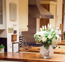
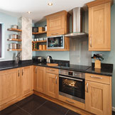
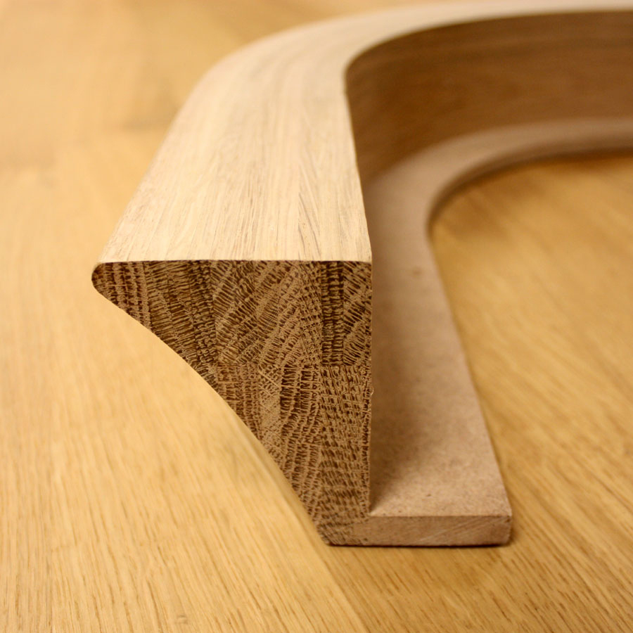
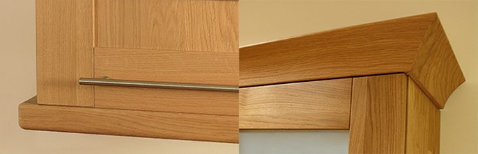
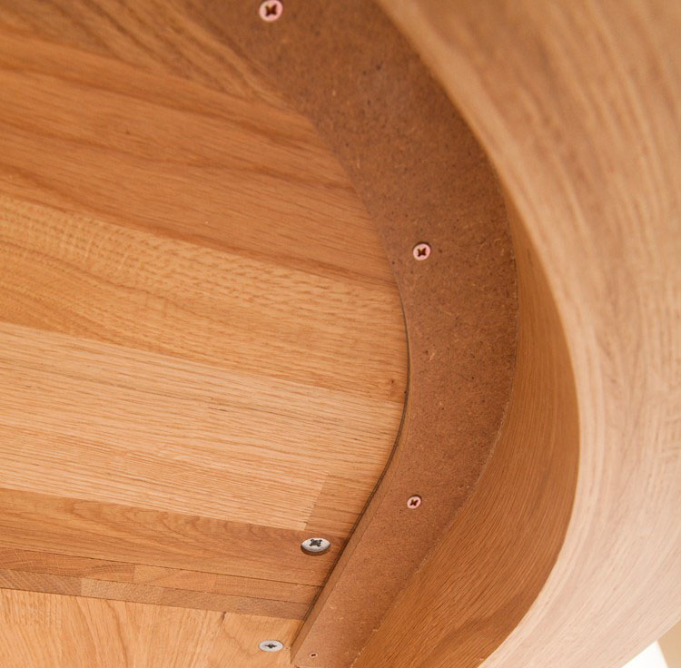
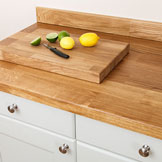
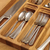
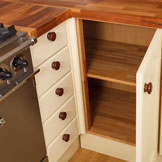
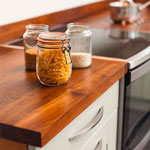
Whether you opt for a Shaker or Traditional door front, our lacquered oak cabinetry is undeniably attractive. At Solid Wood Kitchen Cabinets®, our customers can combine high-quality components to create stunning oak kitchens that are sure to serve them well for many, many years to come.
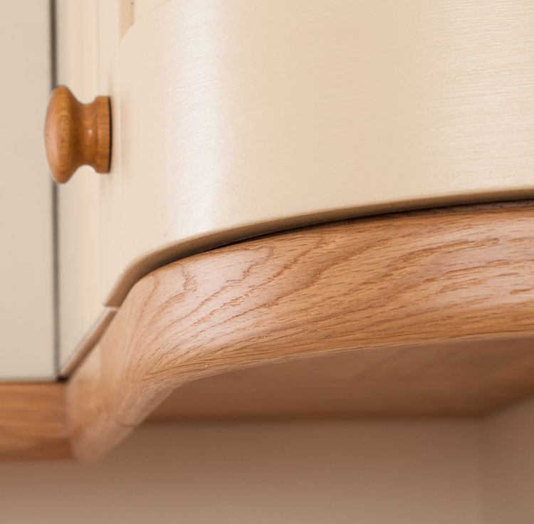
If you are considering painted frontals, or would like to decorate your kitchen walls, we recommend a high-quality finish to equal that of your new cabinets. With this in mind, we have devised this guide to our top eight paint colours from our preferred manufacturers Farrow & Ball, all of which are perfect for complementing beautiful oak kitchens.

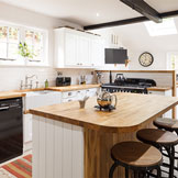
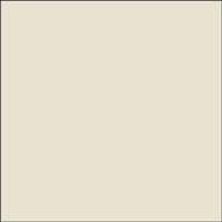
Wimborne White
Fresh Wimborne White takes its name from the beautiful market town of Wimborne, in which the very first Farrow & Ball factory was built.
A wonderfully clean-feeling colour, Wimborne White looks splendid alongside oak and is perfect in both modern and country kitchens.
A tiny dose of warm pigment has been added to this white to give it the soft versatility that makes it such a popular colour for woodwork.
Our recent blog post about white kitchen designs is a good place to start if you are looking for inspiration for a white kitchen.

Pointing
Similar to Wimborne White, Pointing is a fresh and undemanding shade. However, a few extra pigments have been added to enhance the paint’s warm and inviting aesthetic.
Named in a tribute to the lime pointing of brickwork, Farrow & Ball’s Pointing is a pretty colour that is a firm favourite for more traditional homes, and looks excellent alongside solid wood cabinets.
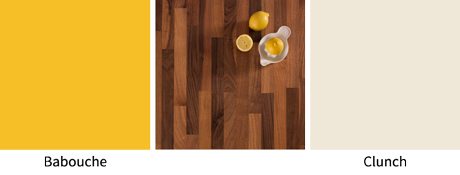
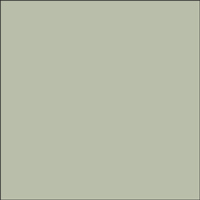
Skimming Stone
If you desire a paint shade with a little more colour to it, warm Skimming Stone has a versatile, stony look that complements natural materials such as oak.
Whilst remaining a quiet and undemanding hue, Skimming Stone looks spectacular on cabinet frontals, or as the backdrop to one of our gorgeous oak kitchens.
To give your kitchen some added impact, team Skimming Stone with Dead Salmon to create a fabulously sophisticated colour palette that attracts attention for all the right reasons!

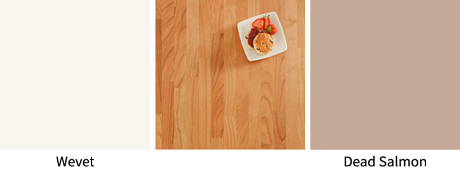
Dead Salmon
Farrow & Ball’s mystical Dead Salmon has the wonderful quality of exhibiting a range of hues dependent on the light and time of day, making in an intriguing choice for any kitchen. In some lights, it may appear to have tones of mushroom, whilst in others it takes on a subtle pinkish tint.
Whatever the hour, Dead Salmon adds a distinctive cosy quality, whilst remaining undemanding – perfect for a candle-lit kitchen to relax and entertain in!
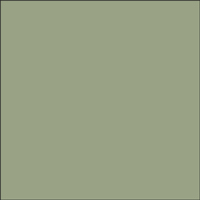
Pigeon
Farrow & Ball’s Pigeon contains dark undertones that make it a bluer, softer take on contemporary greys. This particular paint is popular on wooden room features, such as panelling, cabinets and kitchen islands.
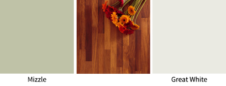
Pigeon makes a beautiful pairing with pale shade Mizzle, a demure combination that looks wonderfully sophisticated.
For owners of country-side cottages, Pigeon is a popular choice, which – despite its bluish hues – takes on warm tones alongside our lacquered oak cabinetry.
Lichen
A stronger, greener shade than Pigeon, Lichen is the ideal paint colour for embracing the great outdoors – inside your home!
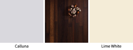
A favoured option for garden rooms and exterior woodwork, Lichen also looks splendid in oak kitchens. We recommend using Farrow & Ball’s Lichen selectively, however, focusing on either a feature wall or a kitchen island unit (for example). Team this shade with lighter alternatives such as Vert De Terre or Lime White for a harmonious look that has plenty of depth and character.
Our colours of the month for July 2017 were all centred around a green kitchen if you would like further inspiration for your design.

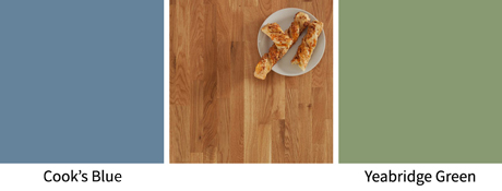
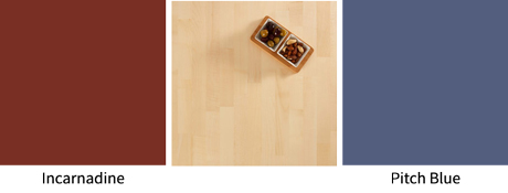
Cook’s Blue
Inspired by the cook’s closet at Calke Abbey in Derbyshire, beautiful Cook’s Blue is one of our favourite kitchen colours from Farrow & Ball! Not only for practical reasons – as it has been suggested that this shade is off-putting for flies – but also because it looks simply stunning with our wood cabinets and solid oak worktops.
You can create a range of effects with Cook’s Blue. For a crisp, nautical look – perfect for seaside homes – team this paint with All White. Alternatively, for a softer, more romantic look, pair it with Pavilion Gray or Parma Gray.
In March 2017, we took a look at colours for a blue kitchen, featuring more beautiful Farrow & Ball shades for your inspiration.

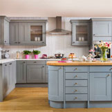
Parma Gray
The prettiest and most delicate of colours, Farrow & Ball’s Parma Gray is a cool shade that is ideal for creating a serene ambience when things are heating up in the kitchen.
Accompany Parma Gray with Strong White for a fresh feel that is ideal for brightening up rooms that are short on space, or partner with Lulworth Blue and Stiffkey Blue for an elegant look in larger kitchens.
All of Farrow & Ball’s high-quality, water-based paints are low in VOCs (volatile organic compounds, which can release chemicals into the environment as the paint dries), making them the ideal choice for use within the home (and for the environmentally-conscious homeowner).
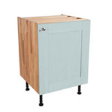
If you are interested in seeing a representation of the stunning finish our cabinet frontals are known for, why not order a miniature replica cabinet door with our frontal sample service? These can be supplied in any of the painted finishes above – as well as sanded, lacquered, or any other colour from Farrow & Ball’s impressive range. Not only that, but we also provide samples of our solid oak cabinets, and can deliver a section of lacquered oak panel straight to your door. All our samples are available at low prices, and can be discounted against a future order if you go on to purchase a kitchen from us.
You may also find the following information guides useful:

Colours to Complement our Wooden Worktops
Creating a Modern Kitchen with Laminate Worktops
Update your Kitchen for Spring
Bring White Kitchen Cabinets to Life with Colourful Accessories
Please note: This guide was originally posted on 24th June 2016, and was updated on 28th March 2018 to include more information on our colour guides.